This case study explores the rebranding and redesign of Clinicorp's new series of online events, Clini+. Our first event under this new branding was Clini+ Finanças, aimed at helping dental clinic managers improve their financial management skills.
Role
As the UX Designer, I was responsible for the audit and redesign of the user flow and interface to improve user experience and reduce drop-offs. I also coordinated and delegated the creation of design assets, and worked closely with developers to ensure accurate implementation for design consistency.
Project Goal
Enhance user engagement and achieve a marketing goal of 1,200 subscribers.
Our primary audience included dental clinic managers with varying levels of expertise in clinic management. These users were looking for valuable, in-depth content that could help them improve their clinic operations. For this marketing campaign in specific, we focused on clinic owners and managers with a low maturity level in management who were proactively seeking content to further develop their abilities in managing the financial aspects of their business.
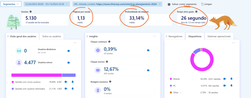
To understand why users were not engaging with our previous event pages, I analyzed data from our last event page using Google Analytics and Microsoft Clarity. I've also analysed user behaviour through recordings.
Our previous online event pages were not meeting engagement expectations. Metrics from Google Analytics and Microsoft Clarity indicated significant drop-offs:
Engagement Time: 21 seconds
Bounce Rate: 48.7%
Scroll Depth: 33.14%
Active Interaction: 26 seconds
User Flow: Only 52% of users moved past the first section
These metrics suggested that our event pages were not compelling enough to hold users' attention or encourage deeper engagement.
Key insights included:
Short Engagement Time: Users were not spending enough time on the page.
High Bounce Rate: Many users were leaving the page without interacting.
Shallow Scroll Depth: Users were not scrolling past the first section.
Limited Active Interaction: Users were not actively engaging with the content.
Based on these insights, it was clear that our event page needed a more compelling and engaging design to capture and retain user attention.
Rebranding: Introducing Clini+
The rebranding of our online event series to Clini+ was a strategic decision to better communicate our commitment to delivering high-quality, in-depth content that helps our clients excel in their clinic management roles.
The name Clini+ is modular, allowing us to incorporate various relevant themes under one cohesive brand. The "+" symbol in Clini+ represents our promise to deliver more than expected – more knowledge, more value, and more support.
Visual Identity
Developing a strong visual identity for Clini+ created a modern, cohesive, and appealing look. Vinicius Maiochi proposed vibrant colors, modern fonts, and clean layouts to attract and retain user attention. Maria Luiza Nazzato designed beautiful and dynamic motion graphics to build a even stronger brand identity for the event.
As for the landing page, we designed a visually appealing page to draw users in and encourages them to explore further, increasing the likelihood of conversion.
Redesigning the Landing Page
To create a landing page that was engaging and effective, we implemented several key changes based on our understanding of user needs and behaviors.
Content Strategy
Maintaining the same content strategy (as we had already itarated on it on previous campaigns) while making it more dynamic with videos and testimonials kept users engaged.
We added testimonials from previous events to build trust and credibility, providing social proof that the event is valuable and worthwhile. This increased user confidence in the event, leading to higher engagement and conversion rates.
Additionally, a personal invitation video from our CEO added a human touch and directly communicated the event's value, making the event feel more accessible and relevant, encouraging users to engage and sign up.
Mobile Responsiveness
Given that our research indicated that most users accessed the event page via mobile devices, we prioritized the mobile experience to ensure that the largest segment of our audience had a seamless and engaging experience. This focus improved user experience on mobile devices, leading to higher engagement and conversion rates. While mobile was prioritized, we also ensured that the desktop experience was optimized to maintain consistency and engagement across all devices, enhancing overall user satisfaction and engagement.
Conversion Strategy
Replacing the traditional form with a chatbot made the signup process more interactive and user-friendly.
The interactive chatbot approach led to higher conversion rates. Mid-campaign CRO tweaks, such as adding a person's picture and a smooth overlay background, further improved the chatbot experience, ensuring users clearly understood the expected interaction. This resulted in smoother and more effective conversions.
By incorporating these strategic changes, we created a more engaging, user-friendly, and trustworthy event landing page that helped our marketing team achieve and surpass the subscription goal of 1,300 subscribers to the digital event.
The redesign results demonstrated the effectiveness of our approach:
Conversion Rate: Achieved an average of 47% throughout the marketing campaign
Engagement Time: Increased by approximately 153.38%, from 21 seconds to 53 seconds.
Bounce Rate: Decreased by about 48.05%, from 48.7% to 25.3%.
Scroll Depth: Improved by around 54.32%, from 33.14% to 51.14%.
Active Interaction Time: Increased by 200%, from 26 seconds to 78 seconds (1.3 minutes).
This project provided several key insights that can be applied to future initiatives.
First and foremost, the collective knowledge and efforts of the entire marketing and customer success teams, combined with the branding team's cohesive design, were pivotal. Their unified approach ensured that our messaging was clear, consistent, and compelling to our client base.
Engaging with our audience and understanding their preferences through feedback and user research was crucial in crafting a solution that genuinely resonated with them. By prioritizing the mobile experience, we acknowledged the predominant way our users accessed the content, leading to significant improvements in engagement metrics.
Additionally, the shift from traditional web forms to an interactive chatbot proved highly effective. The conversational nature of the chatbot made the signup process feel more personal and less transactional, which greatly enhanced user experience and conversion rates. This project reinforced the importance of flexibility and continuous testing, as evidenced by our successful CRO test adjustments.
Overall, actively listening to users and adopting a user-centric approach were fundamental to achieving our goals.
Building on the success of Clini+ Finanças, our next steps involve expanding the Clini+ series to cover a wider array of relevant topics for our clients. The upcoming event, Clini+ Marketing, will focus on helping dental clinic managers and owners improve their marketing strategies.
For the Clini+ Marketing event, we plan to refine the landing page further based on user feedback and engagement data from Clini+ Finanças. This includes optimizing the mobile experience even more, incorporating additional interactive elements. Most importantly we will keep monitoring key metrics and conducting A/B tests to refine our strategies continuously. By staying agile and responsive to user feedback, we aim to maintain high engagement and conversion rates for all future Clini+ events.


