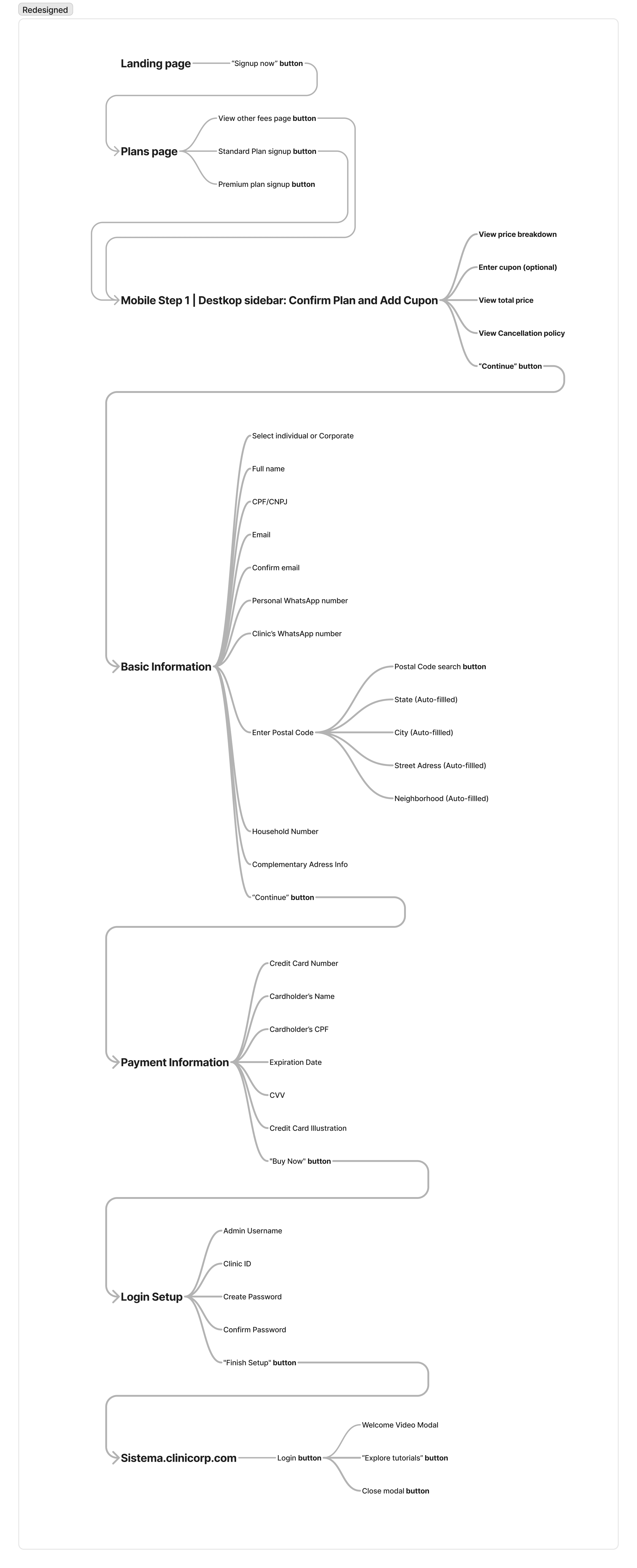
This project involved redesigning the self-service signup process for Clinicorp, a leading SaaS provider for dental clinic management in Brazil.
Role
As the UX Designer, I was responsible for the audit and redesign of the user flow and interface to improve user experience and reduce drop-offs. I also coordinated and delegated the creation of design assets, and worked closely with developers to ensure accurate implementation for design consistency.
Project Goal
Improve user experience (UX) and reduce drop-offs for Clinicorp's self-service signup process.
Imagine a dentist eager to streamline their practice. They land on Clinicorp's website, excited about the solution. He's now decided to purchase, but then encounters a confusing sign-up process. This is what we observed in the current user journey, and through feedback. Endless forms, unclear instructions, and a dated interface create a frustrating odyssey. This complexity led to:
High Drop-off Rates: Users abandoned the sign-up process, leaving Clinicorp with lost leads.
Frustration & Support Burden: Users felt lost and frustrated, leading to increased support requests for the sales team.
Not a Mobile experience: No mobile-friendly experience existed, despite significant mobile traffic (55%).
These symptoms were identified by the CX leader and me. We presented our findings to the CTO, advocating for a redesign. After gaining approval, we moved forward to investigate the problem through the eyes of our users and address the underlying issues causing these symptoms.
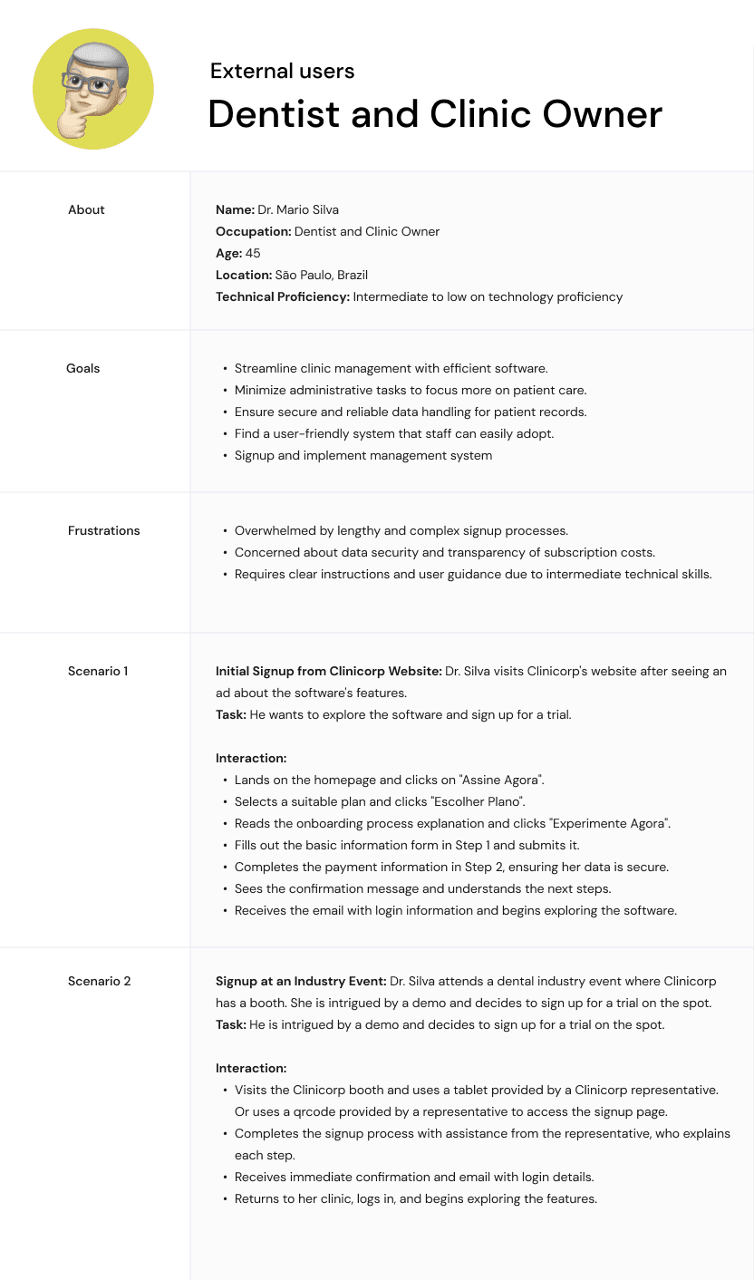
Our user base included dentists, clinic administrators, and office managers. Our user research indicated that a significant portion of users have low to moderate technical proficiency, requiring a simple and intuitive signup process.
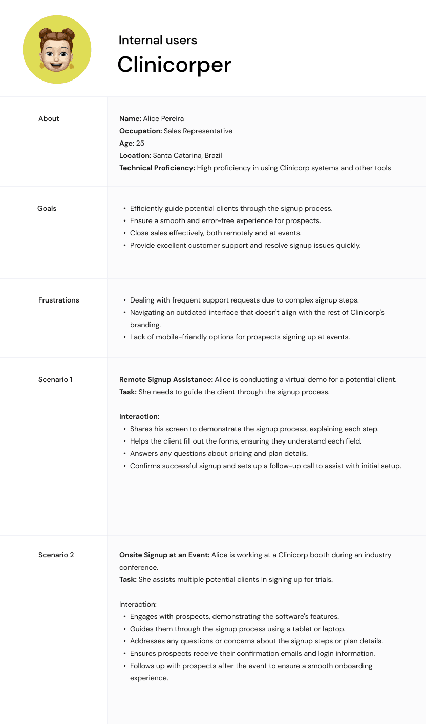
But it wasn't just external users. Internal stakeholders, like the sales team, were burdened by sign-up support requests.
To address this, we focused on:

External
users
Streamlining the signup experience for efficient task completion and minimizing cognitive load.

Internal
users
Alleviating support requests by simplifying the process and improving user experience for all stakeholders.
We developed personas representing our primary users. Scenarios included completing the signup on both desktop and mobile devices, assisting Prospects on signup on a tablet.
To further investigate users pain points and really scope the problems with the existing solution, we conducted:
User Interviews: We conducted interviews with users and internal stakeholders both during events and targeted interviews to understand user challenges.
Questions: What challenges do you face during the signup process? What information do you need to feel confident in completing the signup?
Key Insights: Users found the process too long and confusing, lacked information about pricing and plans, and encountered technical issues on mobile devices.
Analytics & User Journey Mapping: Analyzed user behavior patterns on the website and other channels with Hotjar and Google Analytics to identify drop-off points.
Competitive Analysis and UI Patterns: To further inform the design and better understand the rules and constraints of a typical signup page and process I researched and read up on the best practices, UI patterns and current signup experiences on other SaaS companies.
Through these methods, we identified key pain points:
Lengthy process
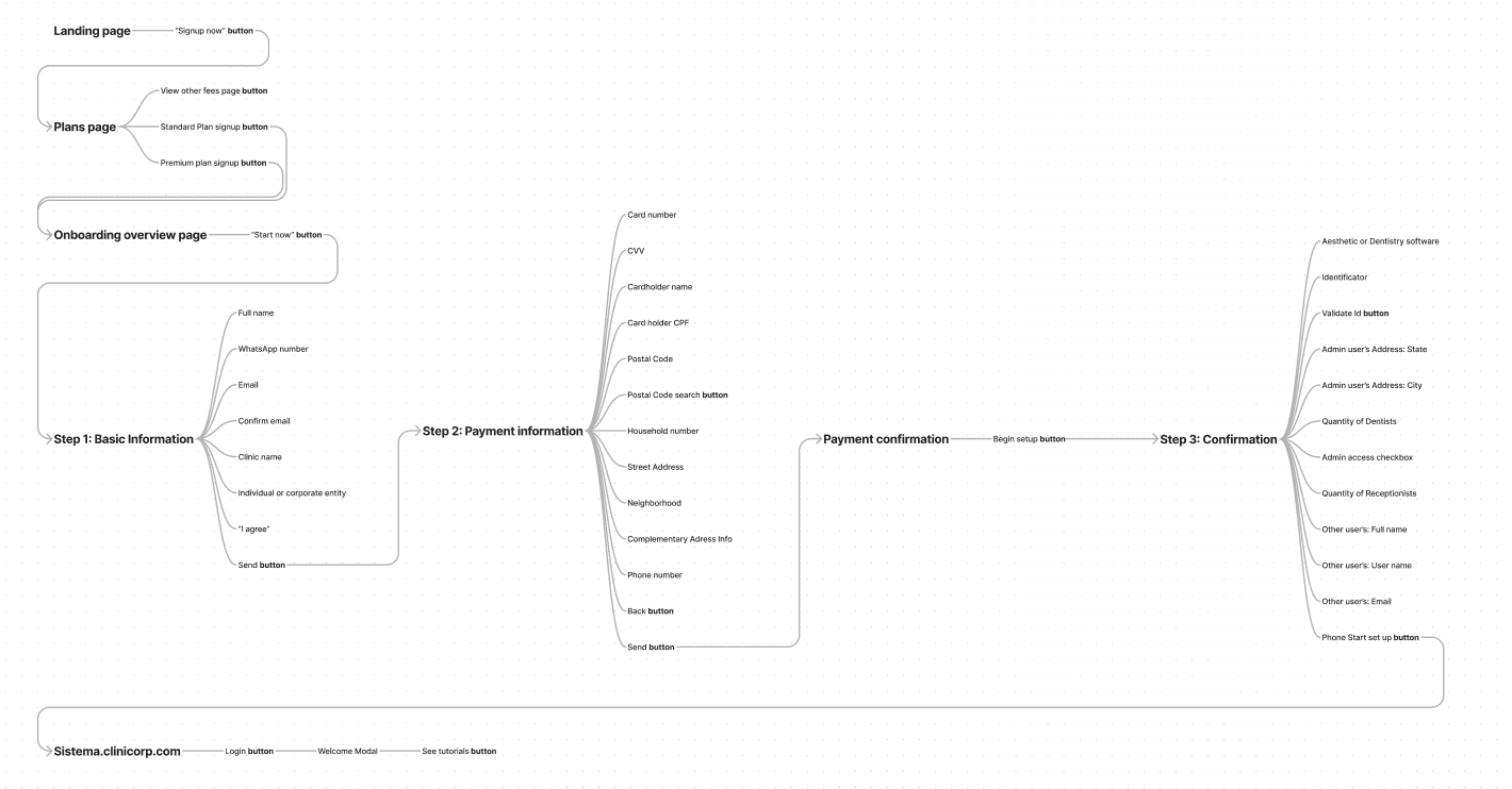
User interviews and user journey mapping painted a clear picture. The existing 6-step signup process felt like a labyrinth. Unclear instructions and a lack of progress indicators left users disoriented and unmotivated.
Furthermore, requiring users to define other users upfront, a step best handled later by the implementation agent, added unnecessary complexity.
Not mobile-friendly
Website analytics revealed a crucial fact: around 55% of users accessed the sign-up page on mobile devices. However, despite a downloadable mobile app, user interviews exposed a critical gap. The mobile app lacked key functionalities compared to the desktop version, and users weren't informed of this limitation during signup. Almost worse, they weren't redirected properly to the app. This disconnect led to frustration and potential churn.
Missing information
User journey mapping revealed a critical gap in transparency. After choosing a plan, users were left in the dark about the specifics during the remaining signup steps. This lack of clear and consistent information throughout the process created a barrier to conversion.
Facing limited details about plan features and pricing, users might hesitate to commit. Fear of selecting an unsuitable plan or encountering hidden fees could lead to signup abandonment.
Dated interface
User interviews revealed a clear perception - the outdated interface felt uninviting and unprofessional. Competitive analysis of other dental management SaaS solutions further emphasized the importance of a modern design and a more straightforward approach. The lack of alignment with Clinicorp's established branding created a disconnect, undermining trust and brand recognition.
Lack of clarity
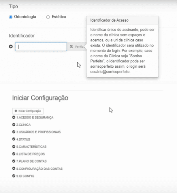
During usability testing we identified that confusing terminology like "identificador" for login ID, unclear button labels like "start configuration" left users bewildered.
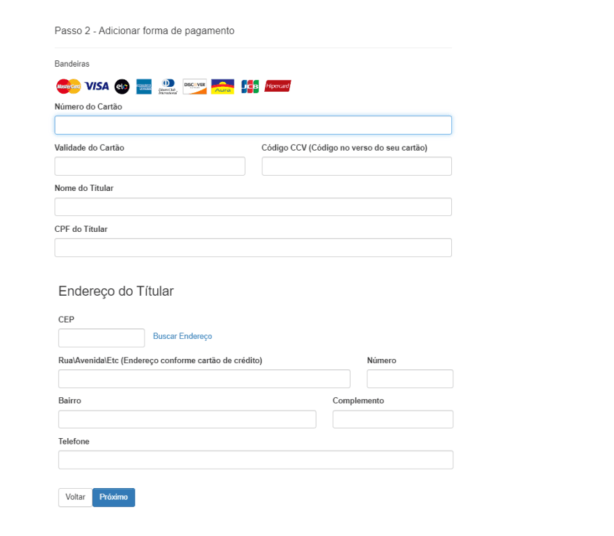
Through interviews with the sales team, we identified a common frustration among support calls - how we communicated problems with credit card.
The lack of clarity potentially lead to abandoned signups due to perceived difficulty.
Having a clear vision is crucial, but bringing it to life requires a collaborative effort. In this project, I collaborated closely with a dedicated team of a CX Project Manager (Natasha), two UI Designers (Gianluca Cerqueira and Gabriel Martins) for feedback and support, a designer (Vinicius Maiochi) and a motion designer (Laura Semidei) for the illustrations and animations in the project, a Developer (Daniel), and the Product Lead for implementation.
Here's how we, as a team, bridged the gap between design and implementation:
Prototypes and Feedback
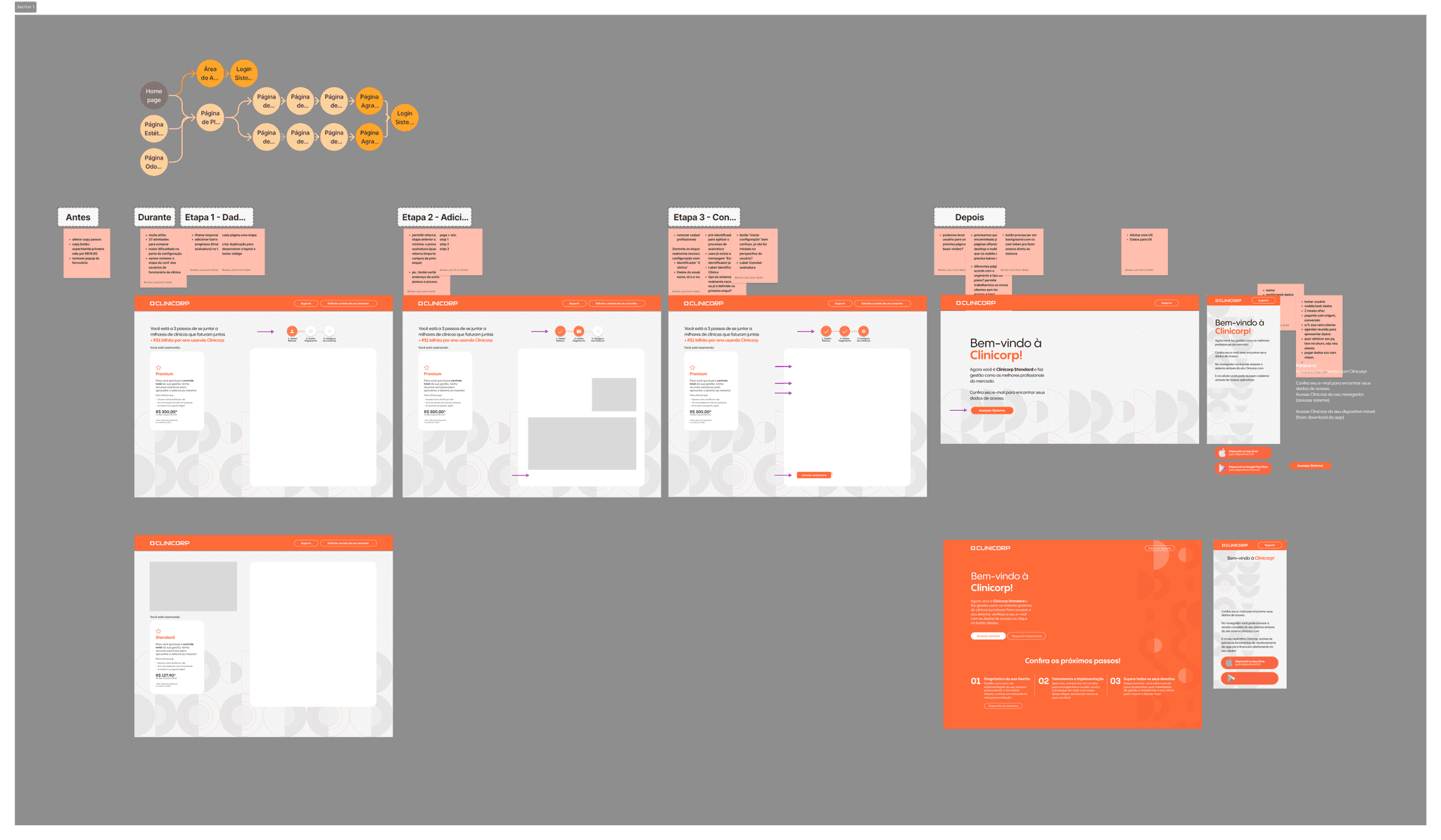
We started with sketches of the new user journey and moved on to wireframes, This allowed for rapid iteration and feedback loops. In the beginning we were evalueating still using iframes for the forms itself, but we dissmissed it when we undertood we couldn't solve users pain points this way.
High-Fidelity Prototype
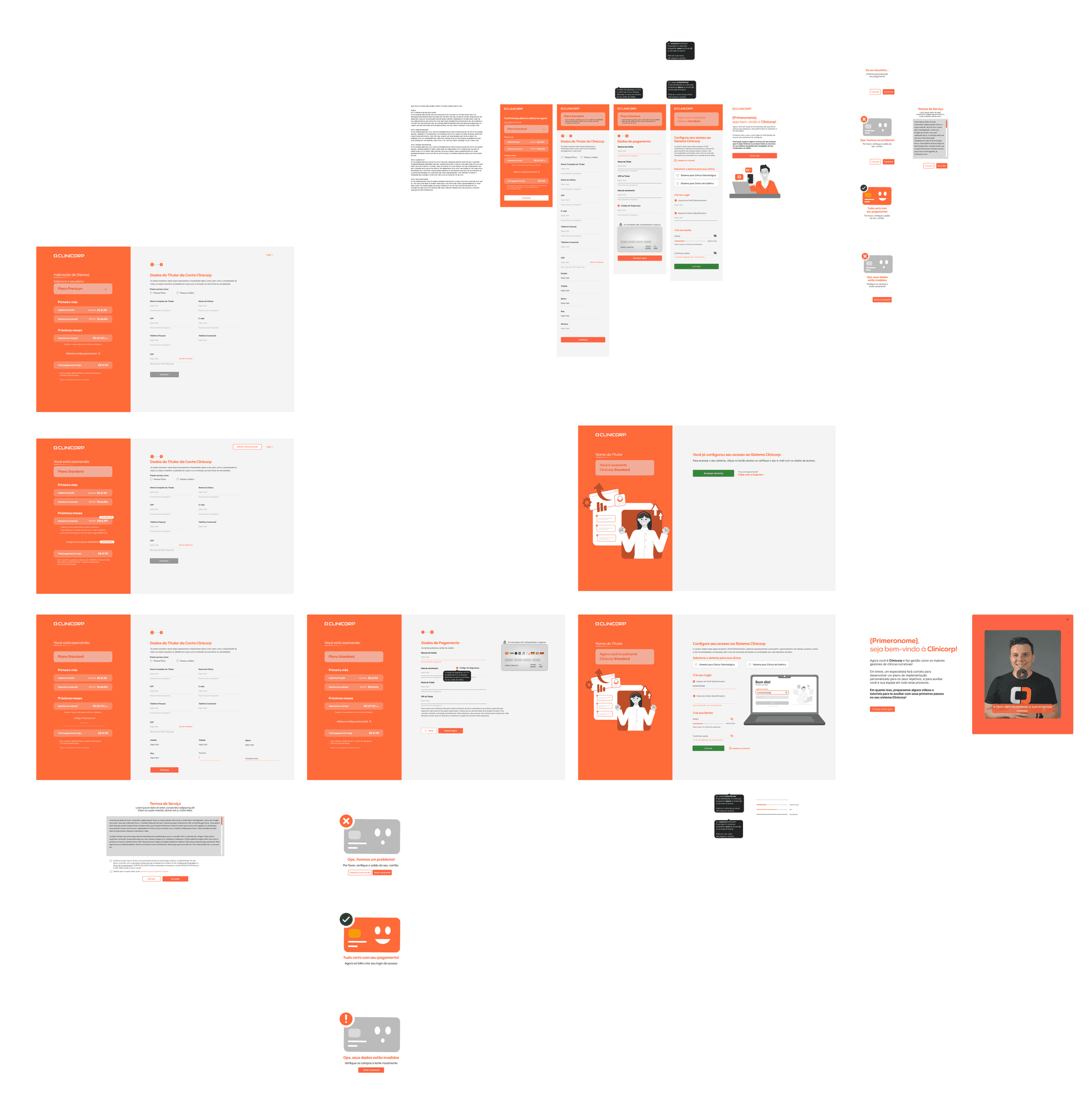
After some iteration, we created high-fidelity prototypes. These interactive mockups mimicked the actual look and feel of the final signup process. This allowed incorporating user experience elements like visual design applying the product's new design system and suggesting ways to improving the clarity of instructions.
Testing & Refinement
We conducted extensive testing. This feedback loop was invaluable in identifying any remaining pain points and refining the design iteratively.
Bringing the Vision to Life
With a tested and refined design, we collaborated closely with the development team. This collaboration ensured a smooth transition from design mockups to a functional signup flow.
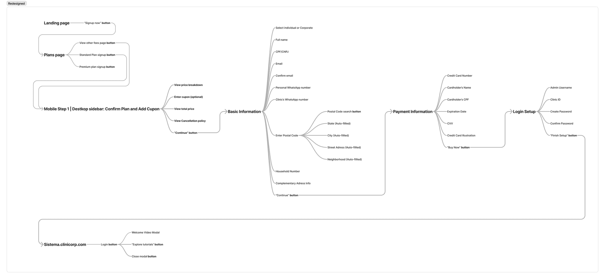
Building upon the identified pain points, we initiated a redesign revolution. Our goal was to create a seamless, intuitive signup experience that would be user-friendly, transparent, and mobile-optimized. Here's a breakdown of the improvements we made:
Simplification
Signup processes should be efficient and focused on the primary goal of acquiring a new user. By simplifying the signup, the perceived complexity is reduced. Users feel more confident and engaged in completing the process. We made the signup process more efficient and user-friendly, minimizing cognitive load and frustration.
Reduced Signup Steps: Reduced steps and number of questions.We removed the need for users to set up additional profiles during signup, deferring this to a later stage handled by the implementation agent.
Clear Instructions: Added detailed instructions and tooltips for each step, guiding users through the process with ease.
Simplified Button Labels: Changed confusing button labels, such as “Start Configuration,” to clearer terms like “Finish Setup.”
Progress indicators: Introduced progress indicators and clear animations to keep users informed of their progress, reducing uncertainty and frustration.
Animations and illustrations: Added clear animations to keep users informed and engaged throughout the signup journey. This feedback loop fosters a sense of accomplishment and motivates users to complete the process.
Mobile Responsiveness
A mobile-friendly design ensured that the 55% of users accessing the signup page on mobile devices had a smooth, uninterrupted experience.
Mobile-Friendly Interface: Designed a responsive interface specifically for mobile users, ensuring a seamless experience across devices.
Mobile-Specific Screens: Created a dedicated mobile screen for confirming plans and adding coupons, providing clear pricing and discount information.
Clear Transition to Mobile App: Informed users about the limitations of the mobile app compared to the desktop version and provided clear instructions for downloading the app if necessary. This transparency built trust and empowered users to make informed decisions.
Usability Enhencements
To reduce friction and improve the user experience we had to make interactions more intuitive.
Real-Time Credit Card Illustration: Introduced a visual representation of the credit card that updated in real-time as users entered their details, reducing errors.
Address Auto-Fill Feature: Implemented an auto-fill feature for address fields based on postal code, minimizing manual entry and potential errors.
Visual and Textual Aids: Provided tooltips and illustrations for fields like Admin Profile and Clinic ID, explaining their purpose with examples.
Streamlined Payment Fields: Simplified the fields required for payment information, ensuring users could complete this step quickly and accurately.
Trust building
By building trust through transparent communication and secure processes, users felt more confident and comfortable completing the signup.
Transparent Pricing Information: Clearly communicated detailed plan and pricing information throughout the signup process, reducing anxiety about hidden fees or unsuitable plans.
Secure Payment Process: Highlighted data security measures to reassure users about the safety of their personal and payment information.
Clear Communication of Subscription Terms: Provided explicit information about recurring subscription charges and easy cancellation options.
Personalized Welcome Messages: After signup, users received a video of the CEO welcoming tem with instructions on how to access features, either via the mobile app or desktop version.
The redesigned sign-up process delivered significant improvements:
Faster Signup Completion: The reduced number of steps and clear progress indicators enabled users to complete the signup process more quickly and efficiently.
Reduced Card dropout: Streamlined process and user-friendly experience led to a 80% decrease in the number of drop-offs, reflecting higher engagement with the new process.
Reduced Frustration: Fewer users reported feeling frustrated or lost during the signup process, as indicated by qualitative feedback. The simpler, more intuitive process decreased the volume of support requests, alleviating the burden on the sales team.
By directly engaging internal and external users through interviews, usability testing, and journey mapping, we unearthed core problems and crafted solutions that genuinely addressed their needs. Simplifying the signup process minimized user frustration and highlighted the power of a clear, concise design.
This project also emphasized the importance of collaboration. Cross-departmental teamwork with CX, Engeneering, and Marketing designers ensured the redesign aligned with business goals, our branding, and technical feasibility.
While initial data limitations existed, we effectively leveraged what we had to make impactful improvements. Ultimately, actively listening to users and understanding their pain points led to significant improvements, solidifying the value of empathy and user-centricity in design.
Migrating the signup process from Wix to a subdomain allowed Clinicorp to gather richer data on user behavior, paving the way for even better future optimizations.
In future iterations, Clinicorp could track additional data points to provide deeper insights and further optimize the signup process, such as:
Time on Task: Measure how long users spend on each step of the signup process to identify potential confusion or difficulty.
Clickstream Data: Track the sequence of clicks and actions users take during the signup process to understand common navigation paths and potential bottlenecks.
Field Interaction: Track interactions with form fields, including errors made, corrections, and time spent per field to highlight problematic fields that need redesign or clearer instructions.
Post-Signup Surveys: After completion, ask users about their satisfaction with the signup process, any difficulties they encountered, and suggestions for improvement.
Conversion Rate by Device: Compare conversion rates between desktop, tablet, and mobile users to identify device-specific issues or opportunities.
Retention Rate: Measure the retention rate of users who completed the signup process to analyze if they continue to use the platform actively or drop off after initial use.
By continuously analyzing data, A/B testing different form layouts, and exploring future iterations, Clinicorp can further enhance the user experience and optimize the signup process for Clinicorp's users.

